chelloveck: a fictional artifact
Inspired by A Clockwork Orange, by Anthony Burgess. This is an artifact from Alex’s world, a magazine that he would have subscribed to and perhaps read in his bedroom while listening to Ludwig van Beethoven, daydreaming about a night out. It is from an alternate universe simultaneously in the past and not-too-distant future.
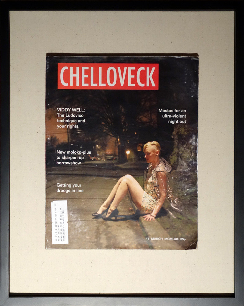
“Chelloveck” 2014
Mixed media, 16” x 20”
With thanks to Kendal Tull-Esterbrook, who posed for the image
A series of 4
About this piece:
Chelloveck was created for Siolo Thompson’s wonderful exhibition, Ex Libris, which opened March 6 at AXIS, Seattle. The artists were asked to pick a book and make a piece inspired by it, roughly at a book aspect ratio. No other guidelines. I picked A Clockwork Orange and was very pleased with my choice–it’s been an extremely influential book (and movie) in my life. I thought about what I wanted to make for a very long time–months–and wasn’t coming up with anything I felt was worthy. So much has been done with the cover for that book, lots of great design.
Finally I thought about why I liked the book and the film, and as with most fiction I love, it was the world it conjured–it was so rich and vivid. It’s set in the “not-too-distant future” but also since the book and film were in 1962 and 1971, that near-future is actually very retro to us. So I thought about that strange future-yet-past world, and Alex’s life there, and the idea of creating an artifact hit me, something transported through time, something that had traversed the fiction/non-fiction barrier.
The idea of a magazine quickly followed–what would he read? It had to look like it came from the late 60s/early 70s. I wrestled a lot with what image to put on the cover. I wanted to push some boundaries and explore what would happen if I showed a scene of ultra-violence, or someone being beaten, a portrayal of the kinds of scenes that would excite and entice Alex. I thought of doing a photo shoot of myself or someone else lying in an alley in the rain at night, or fending off an attacker, an action shot. But if I showed a scene like that, am I promoting misogyny or glorifying violence? Well, is the book? A good question, probably with many answers. I happened to have some issues of LIFE magazine from the 60s and 70s, and looked at the topics and imagery they put on their covers. Coincidentally I had recently picked up some “men’s” magazines from the 50s and 60s… like this issue of Swank. I thought of their covers, always with an alluring model, and thought of Playboy or other girlie mags–they always show a scene that the reader might want to jump into, a scene ready for the action to start, but it hasn’t started yet. The reader would be the one starting the action.
So then I knew that my image needed to focus on the moment before the action started, showing someone in a situation that Alex would be happy to take advantage of. This enabled me to walk a very fine line of showing a female in a potentially weak position, but also not inherently weak herself. The danger and potential violence would be generated in the viewer’s mind, eyeing the scene as a predator.
I hope a bit of that comes through.
Regarding the construction, think of it as part ready-made, part assemblage, part visual design. The body is a LIFE magazine from the 70s. I re-made and affixed the new cover, and distressed the hell out of it using the original vintage magazine cover as a reference. The mailing label shows Alex De Large’s home at the address where the interiors of his flat were shot in Kubrick’s film. I float-mounted it in a shallow shadow-box frame to emphasize the nature of the whole artifact (the idea of the artifact), recovered and materialized from an alternate universe.
I’d like to do a whole series of fictional artifacts someday.